Logo Design
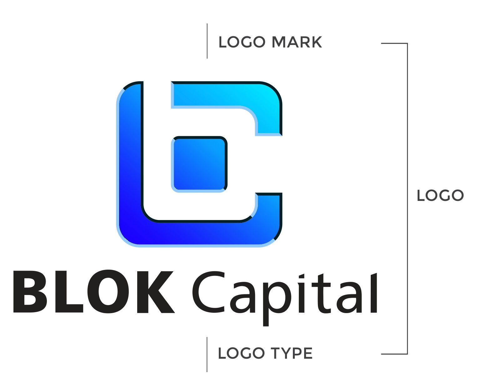
The BLOK Capital logo is a foundational element of our visual identity. It features a custom-designed symbol paired with a distinctive logotype, crafted for flexibility across diverse applications and environments. This section outlines the official logo formats, usage guidelines, and visual standards to ensure consistent and impactful representation of the BLOK Capital brand.
Primary Logo
The primary logo should be used whenever possible to maintain brand consistency. It includes the logo mark and the logotype in a balanced composition.


Mono Color Logo
In cases where full color printing is not feasible (e.g., due to production cost constraints), a mono color version of the logo should be used. The logo should either be in a dark color on a light background or in a light color on a dark background. Avoid any loss of contrast.
Black Logo on White Background
White Logo on Black Background
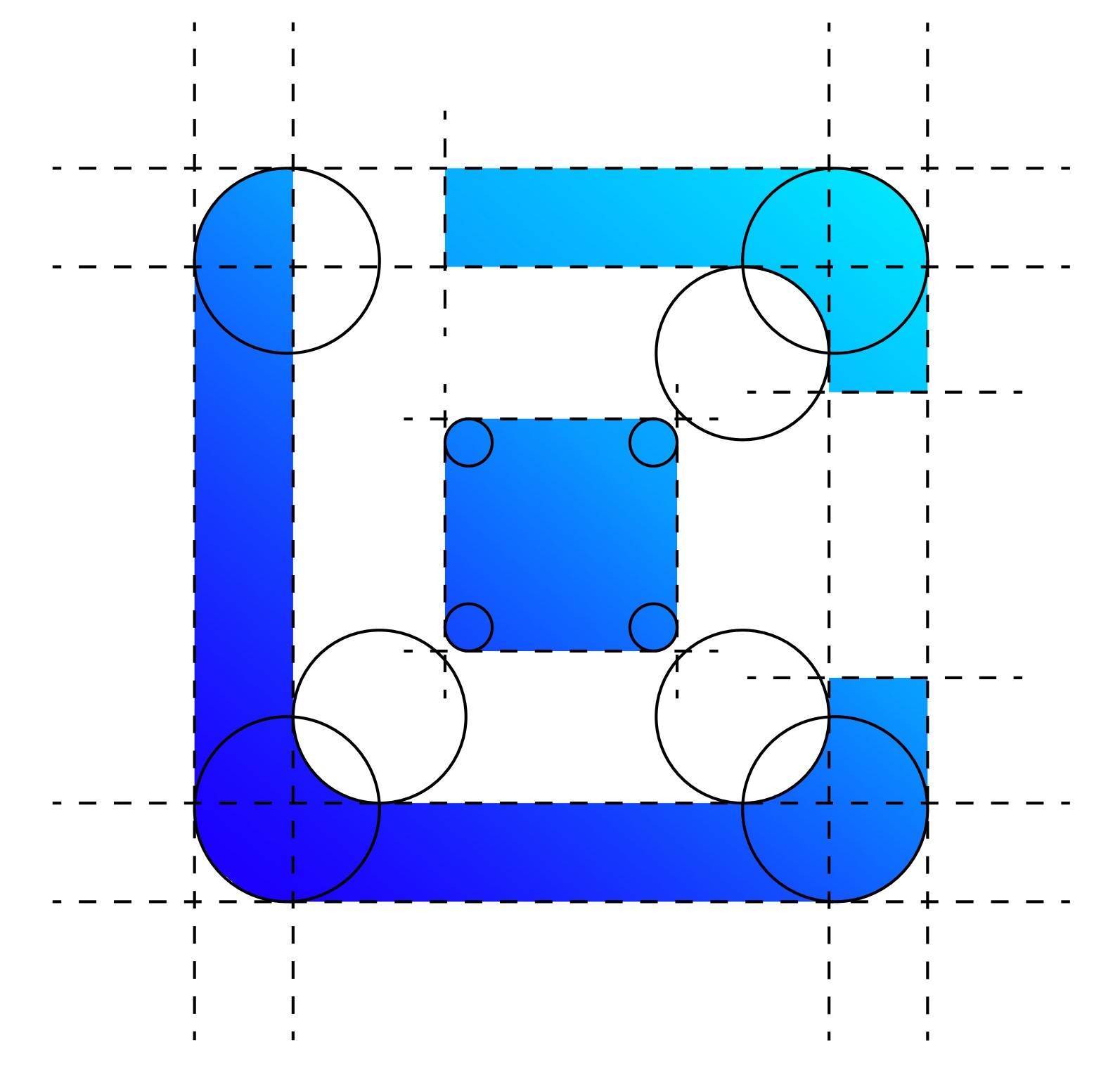
Mark Construction
The BLOK mark is built using a precise grid and geometric shapes. This ensures balance, clarity, and consistency across all uses.
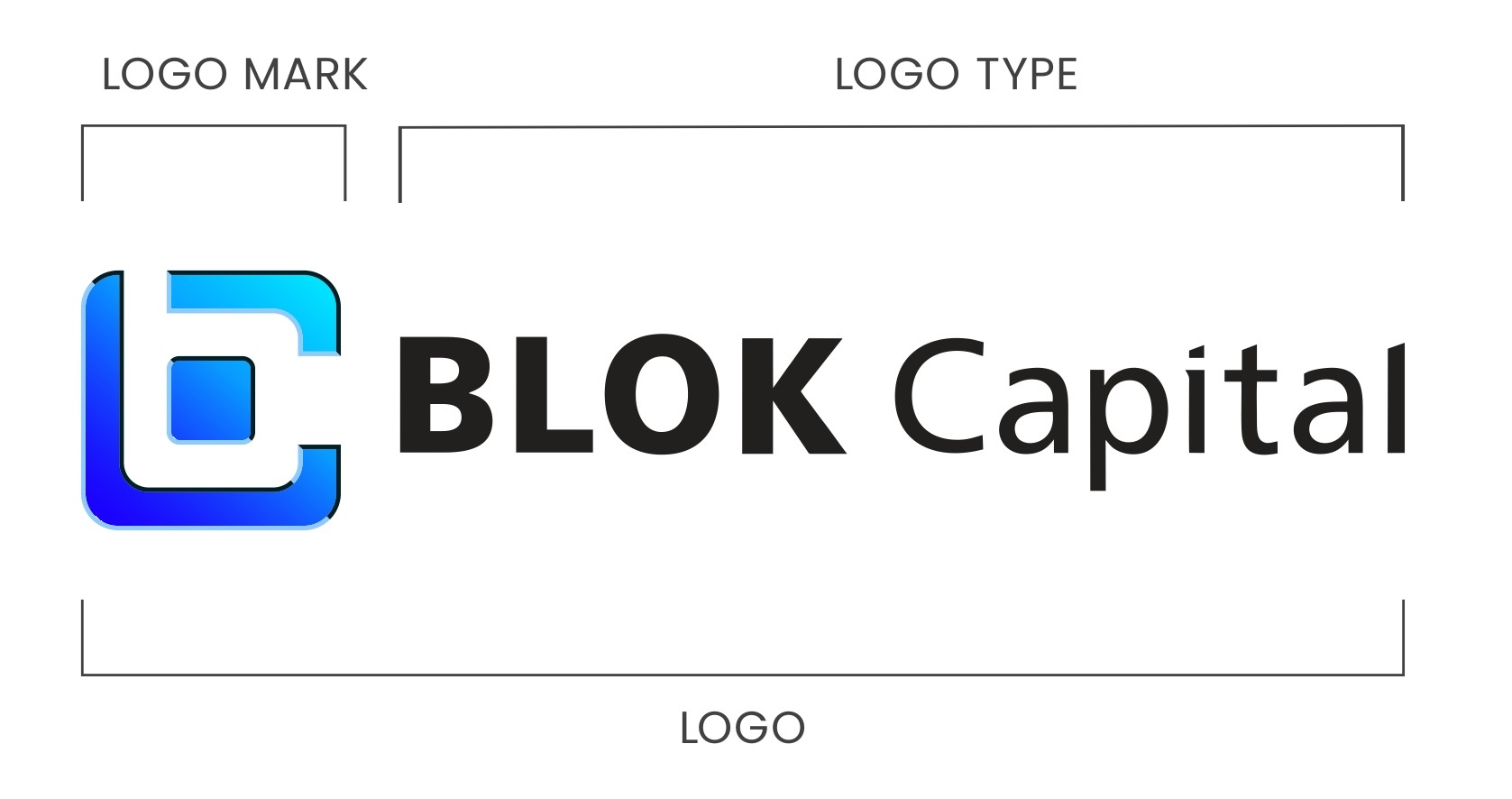
Horizontal Logo
This version is used when the layout demands a wide and short form factor. Ideal for horizontal spaces like website headers or letterheads.
Vertical Logo
When a square or compact format is required (e.g., cover pages, profile icons), the vertical version should be used. It stacks the logo mark and logotype vertically.
Logo on Various Backgrounds
Here are approved color combinations for placing the logo on different backgrounds. Ensure proper contrast and avoid overly complex backdrops.
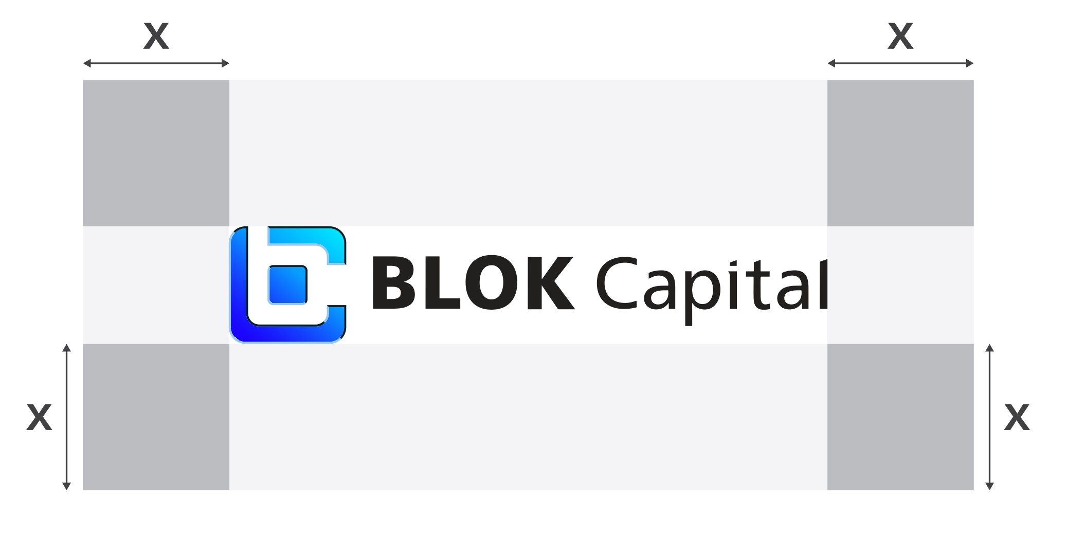
Logo Safe Zone
To maintain clarity and impact, preserve adequate whitespace around the logo. No other design elements or text should enter this area.
Improper Logo Usage
To protect brand integrity, never alter the logo. Here are examples of incorrect uses that should be avoided:
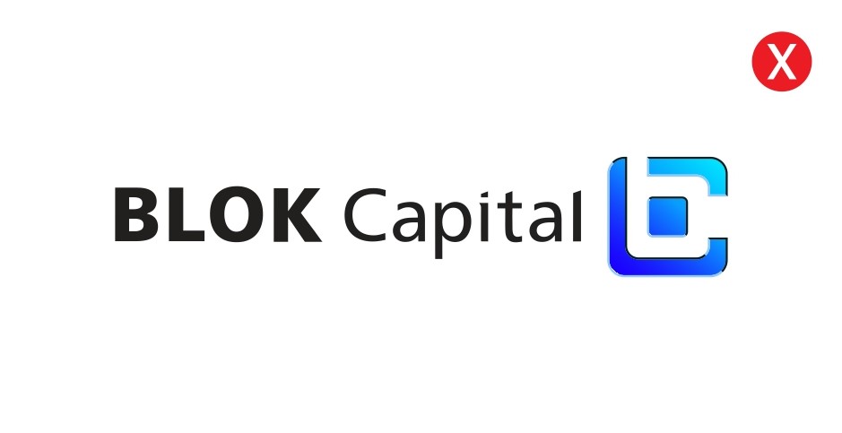
Don’t place the icon after the logotype.
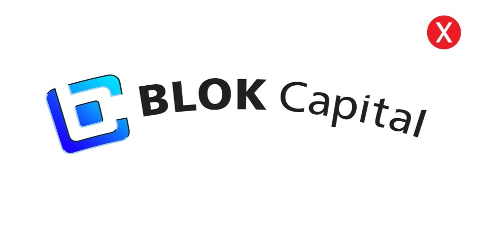
Don’t distort or warp the logo.
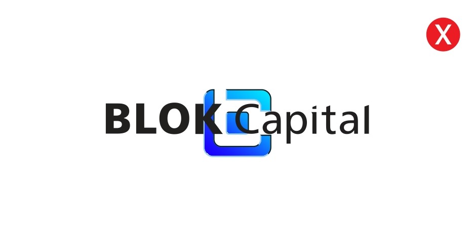
Don’t overlap the icon with the text.
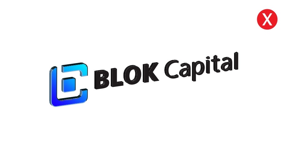
Don’t use 3D or heavy effects.
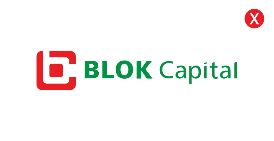
Don’t change the brand colors.
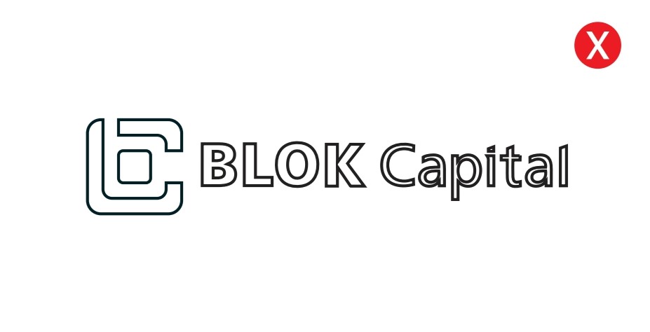
Don’t outline the logo.
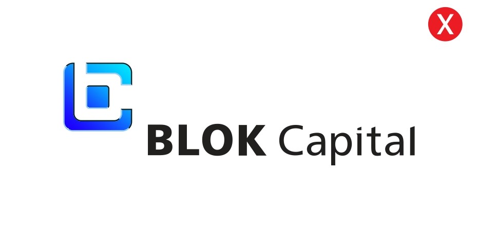
Don’t rearrange logo elements.
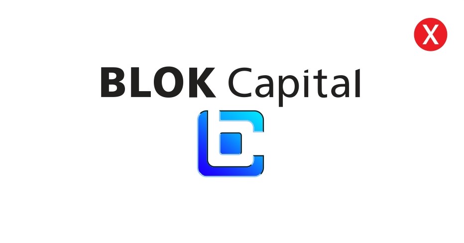
Don’t stack the logo vertically.